I’ve been meaning to write something about NDepend for a while now. It is essentially a tool to give you deep insight as to various aspects of your codebase. It has lots of features, can provide a tonne of metrics, and has very good Visual Studio integration. Any engineering discipline puts a lot of emphasis on metrics, and NDepend is a tool which can give you these in an easy to use manner.
Getting Started
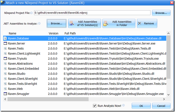
For a quick demo, I’ve set up NDepend version 4 on a machine with VS 2012 installed. I’ve clone the RavenDB codebase from github, and opened it up. After building the project, from the VS menu bar, I’ve clicked NDepend > Attach New NDepend Project to Current VS Solution. This allows be to select assemblies that have been built, from which I can add and remove more assemblies:
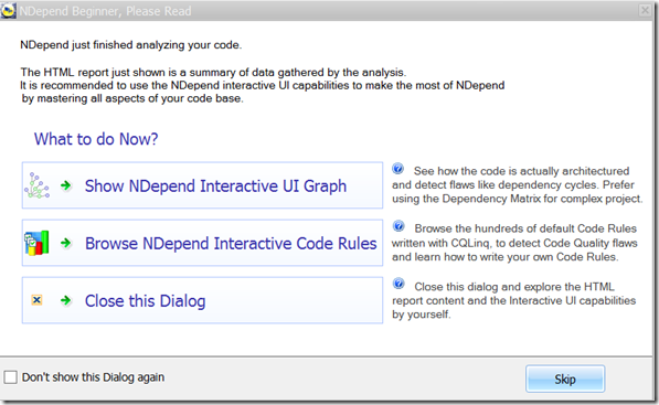
After removing a few assemblies from the list, I run the analysis. This gives me the following dialog:
If not previously dismissed, it also gives a web page showing a summary of results that can be delved into.
Interactive Code Rules
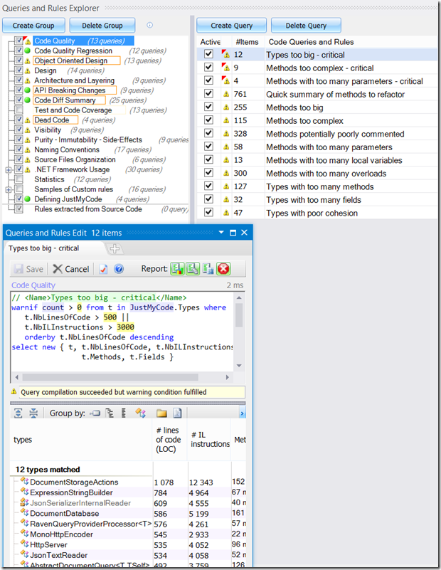
For the time being, let’s see what happens when we click the “Browse NDepend Interactive Code Rules” button. We are presented with two windows – the Queries and Rules Explorer and the Queries and Rules Edit pane:
As you can see, there are a myriad of rules under various categories. Selecting a rule from the Queries and Rules Explorer shows it in the Edit pane. As you can see, when the “Types too big – critical” rule is selected, the Edit pan has the following query:
If the syntax for that seems familiar, it should – it’s CQL (Code Query Language) which is essentially Linq-to-your-code. I’ll point out a couple of interesting points about the Edit pane (out of many). First, the results of the query in the Edit pane are shown right under it – and it updates in real time. So changing 500 to 400 in the Edit box would almost instantly show the new results. Second, the Edit box has some very cool intellisense – not only do you get code completion, but simply hovering over an element of interest will give you some detailed documentation about it. Queries like these can be saved for later use, in addition to the large query library that comes built in. And a wide range of metrics are available – from simple things like large classes and methods, to methods with too many parameters, to cyclomatic complexity, cohesion, etc. – the list goes on and on.
Dependency Matrix
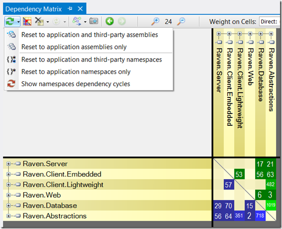
After closing the previous tools, open up NDepend > Dependency Matrix. After filtering to application assemblies only (via the arrow next to the refresh button on the top left), we get this matrix:
What the weights represent can be adjusted (member, types, fields, indirect usage etc.). However, instead of simply representing values, this matrix can give us some valuable insight. For example, if blue cells exist only below the diagonal line in the middle, and green cells exist only above it, then it indicates perfect layering with no dependency cycles. A square like pattern around the diagonal is a sign of good cohesion. Rows with a lot of blue and columns with a lot of green indicate popular code – we may have to be careful if we are making breaking changes in these things. Columns with a lot of blue cells, and rows with a lot of green cells signify that something might have a lot of responsibilities.
NDepend also allows u to generate Dependency Graphs from the matrices (or even CQL queries) with a click of a button.
Metrics
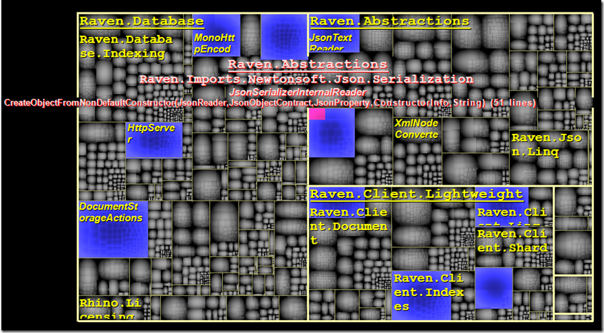
The last tool we’ll look at today is NDepend > Metrics. At first glance, this result may look a bit weird. However, with a little tweaking, it looks like:
Ok, so that’s still weird. What it is, is a visual representation of a particular metric. For instance, the visualisation above uses the following CQL query:
In other words, across the application assemblies in question, we are showing the relative size of each method, with the top 10 methods of each assembly highlighted in blue. We can also check info about the methods by hovering. For example, we can see that JsonSerializerInternalReader’s CreateObjectFromNonDefaultConstructor(…) has 51 lines of code. In the graph, “bigger” squares represent larger weight values for the corresponding elements under a CQL query.
How is this useful?
From an engineering perspective, these sorts of visualisations and numbers are incredibly useful. However, they can be beneficial in common day to day scenarios as well. They can help identify potential problem areas, and flag up issues today so that they don’t come back to bite us (much harder) a few months down the line. They can also help in analysing a new code base, or finding areas where improvements can be made. Even better, we can get an idea as to what will provide the most bang for the buck in terms of refactoring. I have used these tools numerous times with new clients to briefly analyse what’s there and come up with suggestions for improvement, or even propose a rewrite of parts in case that looks more feasible. And even if I do go for rewriting certain things, the reasons behind them are captured in the numbers rather than gut feelings. Recently, I had to work on a product spanning a few solutions where one had hundreds o projects, and quite a few had more than 30. We were looking at extending a small bit of functionality, and replacing another small bit. However, due to a legacy codebase, classes were intertwined to no end. NDepend proved invaluable in figuring out what areas we needed to be careful about – directly or indirectly. It took us a few days to come to conclusions whereas it would have taken weeks had we not had such powerful tooling.
How to not use it (IMO)
NDepend can be used from a build server – failing the build unless certain metrics are met. Many would like this, I would not. To me, the role of metrics is not to stop people doing anything, or doing things with a morbid fear of failure. The role of metrics is to give us a better understanding of the past so that we can do better in the future. And metrics are numbers – while they won’t lie, they’re only as valuable as the capability of the user to understand them and take the necessary decisions. Just because a column has some blues, or there are some black cells in the metrics does not mean everything’s going to the dogs. It may indicate that there might be a problem, or it could be that there is no problem at all. For example, the things that make sense for a re-useable component used in many projects are expected to be different from those that are in desktop UI application projects. Don’t follow anything blindly, always use your judgement and see if something is actually relevant in your scenario.
Conclusion
NDepend can be incredibly useful, and is quite straight forward to use. You can download a free trial from http://www.ndepend.com/
Disclaimer: Patrick has kindly provided me a free Professional license to try out the features. This was a long time ago, and the more I use it, the more I recommend it.

